
Coho Collective Rebrands for a Fresh New Look
- Jan 5, 2023
- 3 min read

Today, we are excited to announce the launch of our new logo and fresh new look for Coho! As we continue to grow and evolve, we realized the need to update our look and feel to better reflect who we are and what we stand for. We loved our old look. As with our name, it paid tribute to the waters of the Pacific and the mountains that define our hometown - not to mention the metaphorical land and sea that nourish and sustain us - fitting for a food company. It was clean, modern, and minimalist and a reflection of what we thought a commissary kitchen should be. But once our kitchens were full, we realized that while clean was non-negotiable - our member community was passionate, bold, and let’s face it, a little messy!
The inspiration for our new brand came from a desire to reflect our big, bold, audacious goal of becoming the BEST place to start a food and beverage business. We wanted to create a more vibrant and human look that was fresh but nostalgic at the same time. We wanted to capture the energy and excitement of entrepreneurship and innovation while celebrating the root of it all - hard work and dedication - the foundation of all handmade food which in essence is never perfect but always made with care and love.
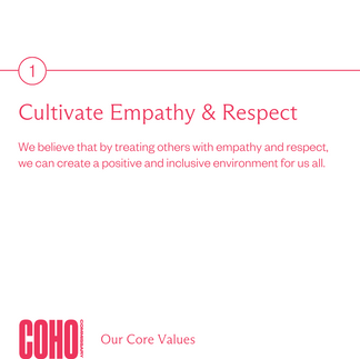
At the heart of the new brand is a focus on our core values. We believe that by treating others with empathy and respect, we can create a positive and inclusive environment for us all. This value is reflected in our new logo, which features a bold and modern typeface with a touch of warmth and humanity in its curves.
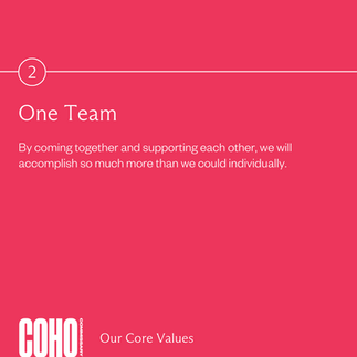
We also believe in the power of working as one team. By coming together and supporting each other, we will accomplish so much more than we could individually. This value is reflected in our new colour palette which features an energetic mix of colours that symbolize collaboration, unity and diversity.


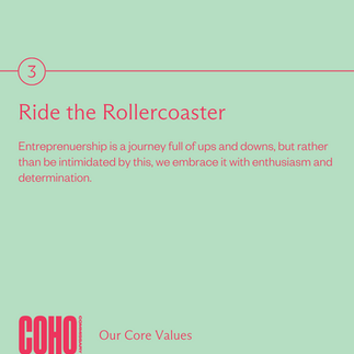
We understand that entrepreneurship can be a rollercoaster ride for us and our members. It’s a journey full of ups and downs, but rather than be intimidated by this, we embrace it with enthusiasm and determination. This value is reflected in our new bold patterns which are playful and daring.
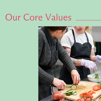
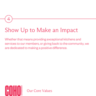
As a company, we are committed to showing up and making an impact. Whether that means providing exceptional kitchens and services to our members, or giving back to the community, we are dedicated to making a positive difference. This value will be seen in our new imagery, which will shine a vibrant spotlight on our members, real people and real moments, highlighting the human side of business.
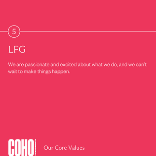
Finally, our new brand is all about LFG - Let’s f*cking go! We are passionate and excited about what we do, and we can’t wait to make things happen. This value is reflected in our new tone of voice, which is vibrant, human, hungry and innovative.


Over the coming months, you will see all our visuals at Coho start to align in this new direction: from the website to our print collateral. We believe that this fresh new brand perfectly captures the spirit of Coho and the direction we are heading. Thank you for your support and stay tuned for more updates!


Comments